Welcome
About This Site
This site provides searchable notes about how to do common tasks in Adobe Illustrator and about the underlying concepts that make it possible to use Illustrator creatively. My goal here is not to present a tutorial. In fact, the notes assume that the user has already taken one or more tutorial classes. The classes offered by Lynda.com, LinkedIn, and even some free tutorials, do a very good job, but you cannot remember everything. However, for millennia, students have relied on taking notes to help them study and apply classroom material. Today many universities have organized services that provide carefully structured class notes that both:
- Spare students the distraction of taking notes while they are concentrating on absorbing the material, and
- Provide a ready reference for applying the techniques learned in class.
This site aims to provide a similar service for Adobe Illustrator training, plus the added benefits that:
- The notes are searchable, and
-
Material from several different sources have been written in a uniformly structured way, and have been integrated into a common conceptual framework.
The conceptual framework of these notes was inspired by the Illustrator Insider Training: Rethinking the Essentials course by Mordy Golding which is offered by Lynda.com and LinkedIn. To make it easy to use the site for reference, we have incorporated subject matter semantics in the HTML and provided a smart search facility that uses the semantics to make the search results more informative, and more conceptually useful. For notes on specific techniques, I have relied on the excellent project-oriented courses by Deke McClelland, also at Lynda.com and LinkedIn, and on several outstanding tutorials available on YouTube. The Resources section at the end of each page, provides links to relevant sources.
Key Concepts
Structure and Appearance
In Adobe Illustrator (Ai) the fundamental graphic object is the Path. Paths have:
- A Structure , which is defined by Anchor Points, and Control Handles, and
- To be visible, a structure must be given an Appearance , which is defined by attributes such as its Fills and Strokes. Attributes have settings which are displayed in the Attributes panel. For example, the Fill attribute will have a color, and a stroke attribute will have a setting for both color and width.
You can give the same path different appearances, and you can apply the same appearance to different paths. In fact, you can save a set of appearances as a Graphic Style and apply the entire Graphic Style to objects with very different structures.
Ai also provides more complex objects including:
-
Container Objects
, which include:
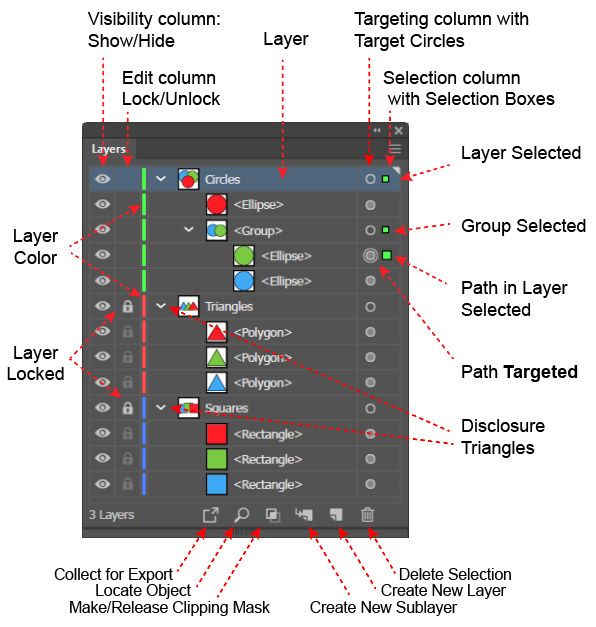
- Layers, which are the highest-level containers in Ai. Paths, groups, text, and combination objects are always in some layer. When you first create a path or text, Ai will always create a default layer into which it places the newly created object.
- Groups are containers that allow you to combine paths and group so that they behave much like a single object.
- Text , which is a group like object that contains, not paths but characters.
-
Combination Objects
, i.e. objects created by combining other objects, which include:
- Compound Paths, which are paths made up of two paths, one of which defines the objects outer boundary and the other which defines an inner boundary around a hole..
- Compound Shapes, which are smart objects that are like compound paths but remain editable.
- Pathfinder Objects, which are groups that are created by combining objects using a legacy tool called the Pathfinder Panel.
To give objects a comprehensible structure, you typically create several layers into which you move the paths (and other objects). When you create a new path, Ai will put it in the currently selected Layer.
Note that:
- To edit an object, you must select its structure, which you can do either in the Layers panel or on the Artboard.
- To edit an object's appearance, you must target it, (i.e., activate its Target Circle) in the Layers panel and target its appearance (i.e., select its row) attribute in the Appearance panel,
However, Ai makes these common tasks easy. When you select an object in the window, Ai selects the layer in the Layers panel and makes an intelligent guess at which object or objects to target. The Layers panel displays both the selection and targeting. To see the details about a targeted object's appearance attributes, you must use the Appearance panel.
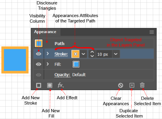
To fully understand any Ai procedure, you must understand the procedure’s effects on the Layers panel and the Appearance panel. Therefore, all of the "how-to" instructions described in these notes will include a description (and often a screen shot) of the before and after disposition of both the Layers and Appearance panel, and will assume that you work with both the Layers and the Appearance panel open.
Stacking Order
In Illustrator, containers, objects in containers and the attributes in the Appearance panel have a stacking order, which is the order in which Ai renders them and the order in which they appear on the Artboard. When items overlap, those that are rendered first are obscured by, and therefore, appear to be behind items that are higher up in the stacking order and rendered later.
Stacking of Layers in the Layers Panel
Layers have a stacking order inside the Layers panel. Ai renders each Layer and all the objects contained in it, in the order, from bottom-to-top, in which they are stacked in the Layers panel. Therefore, objects in the top Layers will obscure (i.e. appear to be on top of or in front of) objects on the lower Layers
Stacking of the Objects within a Layer
Ai will always place an object in the currently selected layer. If no layer has been created, Ai will create a default Layer named Layer 1. In general, a Layer will contain several objects, and each Layer has a disclosure triangle, which you can use to show or hide its contents.
Within a Layer, the objects, which may include groups, have a stacking order, which is:
- The order from bottom to top in which the objects were created in the Layer, and
- The order (from bottom to top) in which Ai renders each object when you display it on the artboard, and
- The apparent depth of the objects on the screen. Objects higher in the stacking order, which are rendered later, will obscure and appear to be in front of objects that are listed lower and rendered earlier.
Stacking within a Group
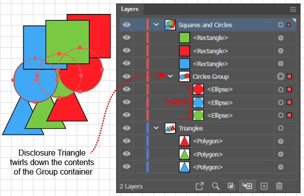
If you place objects in a Group (via the Object > Path > Group command, shortcut: (Ctrl + g), the objects will have a stacking order within the Group. The Group will appear as an object in a Layer. You can twirl open the Layer to reveal its objects, and twirl open the Group object in the Layer to reveal the objects contained within the Group.
As with the order of the Layers and the order of the objects within a Layer, the order of the objects in a Group represents both the order (from bottom to top) in which Ai will render the objects, and the apparent depth of the objects when displayed. Again, objects higher in the stacking order, which were rendered later, will appear in front of objects lower in the Stacking order, which were rendered earlier.
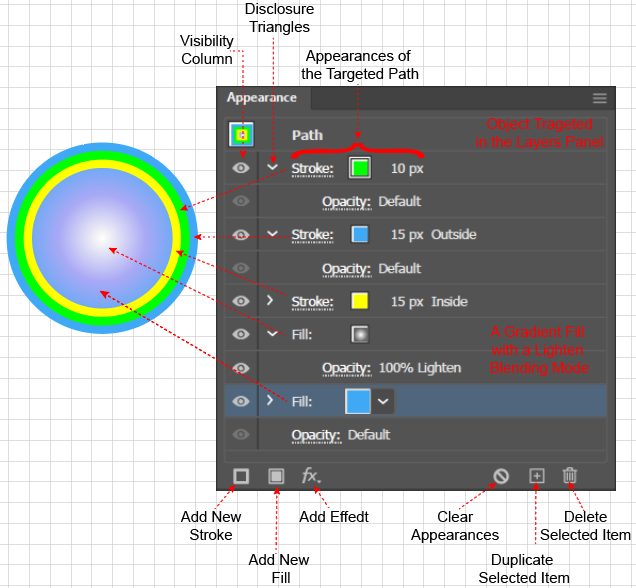
Stacking of Object’s Appearance Attributes
As with the above cases, Appearance Attributes have a Stacking Order, and the Appearance panel is the only place that displays all of a selected object's Appearance Attributes and allows you to change their stacking order. The stacking order in the Appearance panel comes into play when:
- Positioning strokes along a path with a Basic Appearance, and when
- Working with a path that has a Complex Appearance.
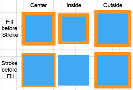
The stacking of appearance attributes is relevant, even for something so simple as properly showing strokes on a path with a Basic Appearance (i.e., a path with just one fill and one stroke). By default, Ai places the Fill before (under) the Stroke and therefore applies the Fill first and then applies the Stroke on top of it. The six squares in the accompanying figure show why. The Stroke panel, which you can launch from the Appearance panel, allows you to position the stroke on the center, on the inside, or on the outside of a path. If, as in the second row of squares, Ai applied the Stroke first, when it applied the Fill, it could cover up part or all of the Stroke.
In contrast to paths with a Basic Appearance, a path that has several Fills, Strokes, or Effects is said to have a Complex Appearance. An Illustrator Effect is a feature that allows you to further modify the appearance of an Appearance Attribute while it remains editable. You can apply Effects by clicking the fx icon at the bottom of the Appearance panel and selecting an Appearance from a pop-up menu. As you add Fills, Strokes, or Effects, Ai will record them in the Appearance Panel and will allow you to change their Stacking Order or to launch operations to edit them. The accompanying figure ("Complex Path in the Appearance Panel") shows the panel's display of the attributes for a path with 3 fills and 2 strokes.
Note that the distinction between simple and complex paths also comes into play when you want to reduce paths to their simplest form, a process called Expanding a path, which you might want to do when, sending art to a printer, sharing art with other programs, or to convert paths with Effects into Basic paths so that you can edit them. You can reduce a path with a Complex Appearance to an equivalent looking object made up of several paths that have Basic Appearances, by selecting the path and executing the Object > Expand Appearance command. In addition, you can further disassemble a path with a Basic Appearance, into an object that is made up of paths that have only one Stroke, or one Fill, by executing the Object > Expand command.
Nested Stacking
You can nest containers inside one another to give a composition a structure that is comprehensible to your future self and to your collaborators. Furthermore, as shown in the accompanying figure, you can use the Layers panel to easily select a single object (or set of objects) anywhere in the hierarchy of containers by clicking the selection squares in the Layers panel. When you select an object in the Layers panel, Ai will show the object in the Appearance panel, where you can see the stacking order of its appearance attributes, and can easily launch the Strokes panel and the Swatches panel to adjust the attributes.
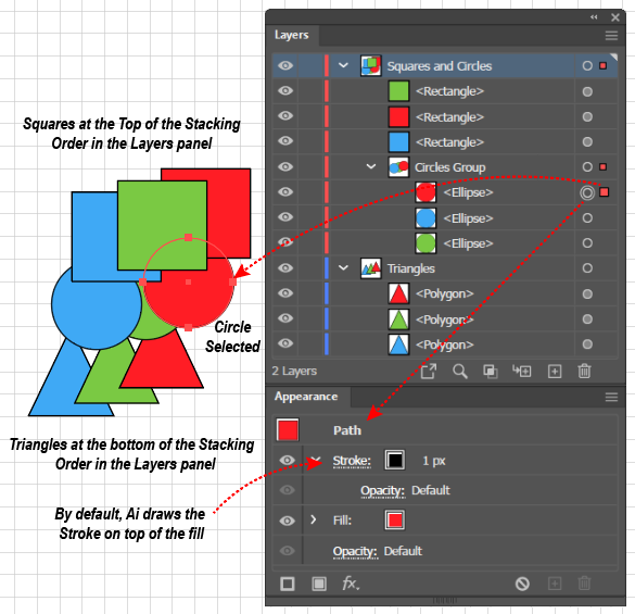
For example, if you have perfect forethought, you could draw the triangles, circles, and squares in the above figure in just the right order so that they overlap as shown. In practice, those of us with less than perfect forethought, might draw the figure as follows: (A) draw each set of 3 objects from left to right on the Artboard in a single Layer, then (B) move the objects in each set up or down in the Layers panel to get them to have the correct depth relative to one another, (C) group the triangles, circles, and squares (which we want to behave like a single object) each into their own Group container, and finally (D) in the Layers panel, drag the Circles group so that it is on top of the Triangles group, and the Squares group so that it is on top of the Circles Group.
The hierarchy of a composition's container structure affects more than the apparent depth of the objects. For example, it determines the scope of the Object > Arrange command. Suppose that an object is inside a Group, which is inside a Layer, and you apply an Object > Arrange > Send to Front command. Then Ai will move the object, not to the top of all the objects in the Layers panel, or even to the top of all the objects in the layer, but only to the top of all the objects in the Group. The result will depend upon the container's position in the containment hierarchy.
For example, in the above figure, if you selected the green circle and executed the Object > Arrange > Bring to Front command, Ai would move the green circle to the top of the other circles in the Circles group, but it would not overlap any of the squares in the Squares group.
Next Steps
The next page, Paths, will focus on Bezier curves and the structure of paths that are created with the Pen tool. The Pen tool is the most revealing and powerful way to create paths, but it is also the most difficult to use. Ai provides easier ways to create paths, but you cannot really understand them without knowing how you create paths step-by-step with the Pen tool. The following page, Appearances, will focus on the mechanics of adding appearances to a path's structure. Subsequent pages will follow the steps in a typical work-flow:
- Managing paths with containers and selecting paths that are inside containers.
- Using productivity tools to create paths more quickly and accurately than using the Pen tool.
- Working with Illustrator's color features.
- Modifying paths that you created with productivity tools to efficiently create richer figures that go beyond basic shapes.
- Combining objects to create more complex objects.
- Adding Text.
- Using the facilities of Illustrator's interface to work more productively.
Style
I observed the following guidelines in constructing these notes:
- Because the Layers panel and Appearance panel are so important in understanding the state of a document and because changes in the state of these panels is so critical to understanding how tools and procedures work, it makes sense to work with these panels open. Therefore, when there are several ways of accomplishing a task, the ones that make use of the Layers panel and the Appearance panel are given preference.
- Similarly, these notes do not burden the reader by attempting to document every possible method to accomplish a given task. When there are many ways to do something, I focus on the methods that use the panels listed in the Window menu.
- When operations use menu commands, I will typically include the entire menu path of the command, rather than simply giving the name of the command or just the shortcut. A typical step in a set of instructions might read: "Execute the Object > Paths > Join command (Alt + Ctrl + j).
- Rather than litter explanations with redundant instructions for both Apple and Windows, I have assumed that most Mac users can translate readily from an instruction written for a Windows user.
- Similarly, I have focused on scenarios and instructions intended for the Web rather than for Print.
- Text in bold is intended to highlight a keyword phrase that uses a term of art. Text in bold and italics is intended simply for emphasis.
- For nouns (such as Group, Layer, Stroke, or Appearance) that have a special meaning in Illustrator, especially when using it for the first time or to emphasize that I am using the term in its special sense, I capitalized the term. For example when referring to objects that are inside of a container, I might say that they are "in a Group," but to refer to objects that have the same style, I might simply refer to "the group of flowers in the foreground."
- Illustrations are intended to go well beyond screen shots. They are designed to illustrate principles and techniques and will often show how operations on the Artboard and in the Layers and Appearance panel correlate with one another. I have tried to apply the principles of Edward Tufte, especially those that encourage:
- Using side by side comparisons, or an array of small figures, to enforce important comparisons and contrasts.
- Avoiding large areas of vibrant colors that visually convert negative spaces into objects.
- Making diagrams information rich to entice the viewer to explore them.
- Avoiding the use of using numbers or letters rather than names in a diagram, and referring to the numbers in explanatory text, and thereby forcing the viewer to make distracting cross references, which become more difficult as the distance between the text and the diagram increases.
Outline
- Foundation
- Managing Paths
- Path Tools
- Color
- Modifying Paths
- Combining Objects
- Type
- Facilities